Tracking Trends with SentiOne – Home Office Case Study
We have recently launched our monthly social media digest series – check out the February edition – and I’m pleased to say it has been received very warmly! This inspired me to take you behind the scenes a little bit – I’m going to show you how the magic happens.
It’s no secret that I pulled all of the data presented in the digest using SentiOne, our very own social listening solution. At the risk of sounding extremely prideful, even I get amazed at how much useful information I can get! I figured, then, it would be in our best interest to demonstrate how useful SentiOne is in action!
For this simple study, we created a project to try and analyse people’s attitudes towards working from home. We actually did this last year, just before the pandemic hit Poland and we were forced to leave our cozy Gdańsk office. Here’s what we learned – and continue to learn.
Setting up the project
For this project, we decided to keep it simple: we only included a handful of keywords that we figured would give us the most results. In the end, we settled on these:
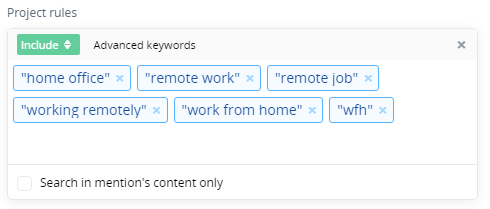
We could, of course, add more criteria to our project. SentiOne allows us to only focus on mentions coming out of a specific country or platform, or even a certain Twitter account. Here, though, we’re interested in gathering as much information as possible – we’ll filter our results later.
It’s also worth mentioning that you don’t need to set your project up a year in advance. SentiOne allows you to look into the past extremely easily – you can go all the way back to 2017. Unfortunately, due to API limitations on social media networks we can’t go back further than that.
Browsing mentions
Immediately after setting up the project we’re taken to the mentions feed. Here we can take a look at the latest mentions as they come in – unfiltered and raw. By default, the view only shows mentions from the last thirty days, but we can change the date range easily enough.
That’s not all – filtering options in SentiOne are very extensive. Let’s say I’m only interested in mentions made yesterday on Twitter, and only by women speaking English. This is a matter of just a couple of clicks in the sidebar. I will then sort the results by their influence score. The influence score is our measure of each mention’s reach and engagement – this allows me to find the influencers, trendsetters, and the relevant discussion points. What did we find?
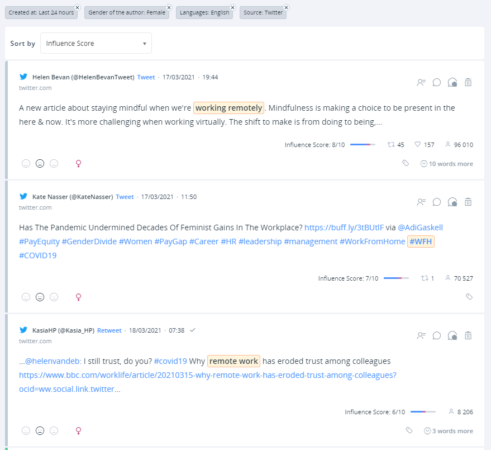
This is good, but we can do better. Let’s keep these parameters, but “zoom out”, as it were – and let’s take all of last year into account. What were the most popular mentions?
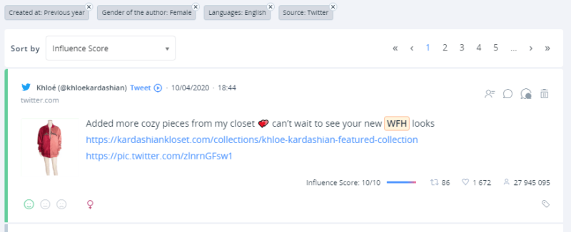
Is anyone surprised that we find a Kardashian at the top spot?
Analysis and the art of finding Interesting Things™
Of course, we could sift through mentions for hours on end – I believe the practice is called doomscrolling – but let’s save ourselves some time.
The analysis tab in SentiOne is where I spend the bulk of my time working on our social media digests. It saves me a lot of time by presenting relevant metrics and data points automatically.
The analysis view is a dashboard of widgets that I can arrange however I like. The default set created with every SentiOne project provides me with enough information to start writing a summary of any topic at first glance.
I can check how much interest there is in the topic by how many mentions it has…
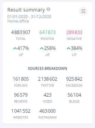
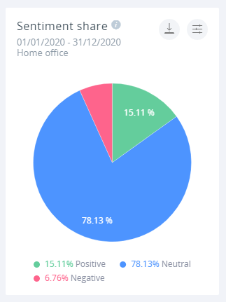
…or check how the internet at large perceives a given topic…
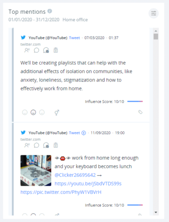
…or even see the top mentions without having to switch back to the mentions tab.
But that’s just the basics. The real magic happens when you start thinking outside the box. For instance, what was the precise moment when we first switched to working from home?
To find that out, we need to do a bit of sleuthing. First, I’m going to take a look at the mentions in time widget to see where the first peak moment happens. We know it happened in March last year, so let’s set the widget to only display mention counts from that month.
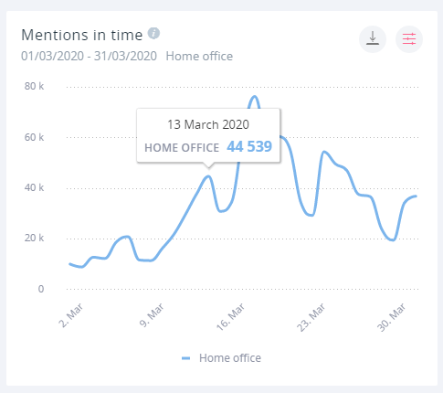
Bingo! The first peak happened on March 13th, with the second, much larger peak occurring on the 17th. With this information in hand, we can go deeper. We know people started working from home en masse on March 13th – but where did those people come from? The pandemic was still spreading around the world by that point – which countries locked down first?
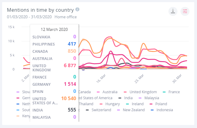
By using the “mentions in time by country” widget, we can see that the two leading countries are the United States and the United Kingdom. On March 17th there is also an interesting peak in Germany.
This, of course, doesn’t tell the whole story. Some countries, such as Vietnam, have largely returned to normal after containing the disease. Others, such as Poland, have oscillated between tightening up and loosening up restrictions at different points throughout the year.
As such, our home office regime might have undergone shifts and changes. Was there a particular point during which things shifted? We can search for it using an “anomalies in time widget”.
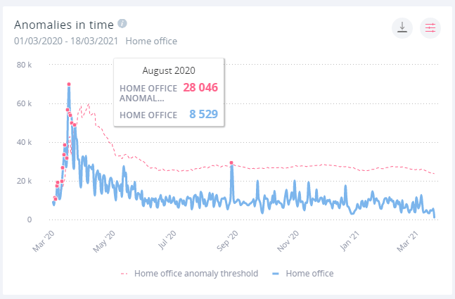
And wouldn’t you know it? SentiOne detected an anomaly in August. What happened then? We’ll do the same thing we did with March, and search through the top mentions in that month.
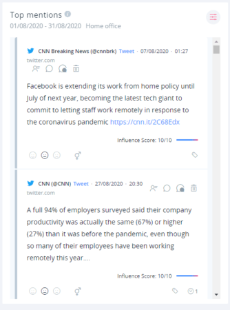
Scrolling through this list – and also by using the mentions tab to filter out tweets from news organizations just to confirm my suspicions – we can come to a conclusion. We can, with a reasonable amount of confidence say that the anomaly detected in August was caused by companies reporting their work from home successes.
Zoom posted record earnings, Facebook decided to extend their WFH policy, employees were surveyed – among office workers privileged enough to work from home indefinitely, the situation was judged favourably. August was the moment we realised the situation might continue longer than we initially thought – and we also took a good, hard look in the mirror to see how we’re handling it.
In conclusion
Collecting the data and coming to these conclusions took me no time at all – and all I did was take the briefest of glances at what SentiOne could provide. Naturally, with more time and effort we could get even better results.
You may have noticed that when we looked at the mentions from different countries, some of them returned 0 results. This is because of language differences – in France, for example, the term “télétravail” is used instead. That’s my fault – I don’t speak French, despite the best efforts of my high school! If I did, though, I would have thought to include that term in our initial project parameters.
As with any other software, the output is only as good as the input. This is a quick-and-dirty project with a very limited scope; despite that, we were able to discover some interesting data points and conclusions. With more time and care (and some fluency in dozens of languages), we would be able to map out the entire story of the COVID-19 pandemic and our reactions to it using nothing but internet mentions.
For now, though, I leave you with this: the analytics dashboard we created for the project. SentiOne allows me to share the exact workspace I used to write this blog post – so you can take a look at the same data I did, and point out if I came to a wrong conclusion.
If this post piqued your interest, might I suggest you get in touch with us? Your free trial run of SentiOne and all its capabilities awaits!


